Tag: UI Design

  • Homepage in 2020

    Homepage in 2020

    So, it’s 2020 and I still like to use a homepage. I don’t like to call it a portal either, but I think that term is actually newer.

    Since 1996, I used Yahoo!, Excite, back to Yahoo, Google’s homepage that was quickly de-commissioned, back to Yahoo and then just Chrome. But Chrome with some recent tab images was just lacking to me.

    So, I started making my own. Initially, I was going to have a simple page and work on styling to make it look like a futuristic UI that you see in movies. I looked into this for a bit, but then I remembered I do something similar for work where I build client sites to integrate with our system. It might’ve been fun, but I wouldn’t have learned anything new. So I stuck with an unstyled page for a little bit and used Yahoo’s APIs and query language, YQL. Of course, this was discontinued shortly after I got started.

    So I scrapped that project and built my site using Vue JS. It was the first time working with Vue and I really enjoyed it, despite the frustrations of working with something new. I picked it partly because React seemed like overkill for what I was doing and Vue seemed simpler and there was something I liked about it from the ‘hello world’ tutorials I read.

    Once I picked the framework, things came along pretty quickly. I made some services that would parse and display news feeds, weather and some articles from different APIs. And I made another service for XML/RSS feeds.

    I never figured out what to call it, so it’s just called a sub-domain called launcher.

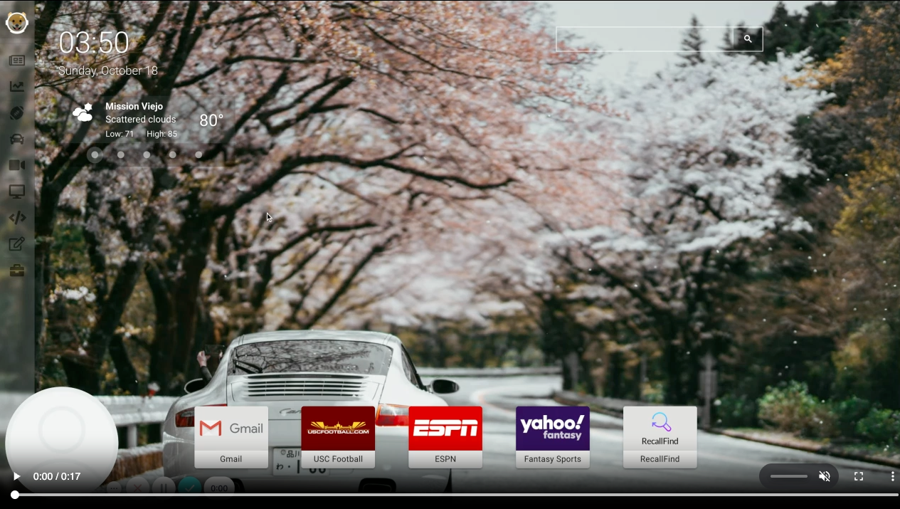
    I have it pinned to Chrome so I start on a tab that:

    1. Uses the Unsplash API to rotate through some images I’ve saved.
    2. Uses a weather API to load weather for locations I’ve saved.
    3. Has links to sites I usually open in the morning.
    4. A Google search bar built into the page, that I’ve never ever used.

    Then, I have other tabs on the page that load content for things I’m interested in like finance, cars, sports, technology and more. Most are newsfeeds, but I made a stock tracker like my old Yahoo page and keep a maintenance log for my vehicles.

    It was all working great until the news API I use (NewsAPI) switched to a paid model, even for a site with hardly any use. So, I’ll have to convert my newsfeeds again, but for now I have a usable portal, I mean home page.

  • Aquarium of the Pacific – Theater

    After the success of the Glass Guild, we were immediately asked to create another page for the aquarium’s new theater. The theater was under construction as well and we found ourselves in a similar situation – a short time frame, limited resources and system complexity.

    However, the Glass Guild was much more abstract where as the theater is something that we’re all familiar with. The were asking patrons to sponsor seats and they would get a plaque with an inscription on the back of it.

    One of the issues with the imagery was that those only had a few 3D rendering of the theater and no model to take pictures of this time. However, they were farther along in construction. So as soon as the seats were installed, I was able to create an image of the theater seating that combined the 3D model and an actual photograph.

    I then made it work similar to the Glass Guild with each section a link that loads a seat map. The seat map was challenging to create because they labeled the rows and seats differently where the even numbered seats are on one side and the odd numbers are on the other side. And there’s some reserved seats, empty spaces, no row I, etc. which apparently are common things in theaters.

    But, I was able to figure something out and the project was also a success. And it looks pretty nice aside from all of the text. I suggested that the background image should be shrunk down and at least half of the text should be removed, but they wanted to keep it this way.

    Anyhow, if you’re in the area (again), you should make a trip to the aquarium. And if you’re feeling charitable, the Pacific Visions seating donation is still open.

    https://www.aquariumofpacific.org/pacificvisions/support/seat_campaign

  • Aquarium of the Pacific – Glass Guild

    One of the special projects that I worked on in early 2018 was a custom donation page for the Aquarium of the Pacific in Long Beach, CA. They were constructing a new building made from unique pieces of glass and had the idea to ask patrons to sponsor each panel.

    It was very exciting and it I felt good about trying to help out a good cause. However, I was given less than a month to put something together.

    The challenges were that we didn’t have many resource from the client and I also had to build this on top on our donation system as well as a seating system that accounts for locations an availability.

    When I first got wind of this assignment, my initial thought was to use what I thought were 3D renderings of the building (since it didn’t exist yet) and map each of the panels to a ‘seat’ in our system. Unfortunately, we weren’t able to get more renderings in time and being that I was working on everything myself from graphics (Photoshop), SVG vector mapping (Illustrator) and all of the coding, we didn’t have time to do this.

    So we were left with some 3D renderings, which actually turned out to be photographs of a model, and some architectural plans. I tried to present the nicer 3D images first and narrow the selection by section. And then we used the architectural drawings to try to visually map the panel to the buttons. It may not be as intuitive as selecting a panel on the 3D images, but again, we didn’t have all of these at the time and I wouldn’t have been able to draw and map 900 unique shapes to our ‘seats’.

    But overall, it came out pretty good considering the time constraints, limited resources and complexity of our systems. And most importantly, it was a success for the aquarium.

    I still haven’t made it up there to see the new building in person, but I hear it’s beautiful.

    So, if you’re in the area, it’s another thing to visit!

    https://www.aquariumofpacific.org/pacificvisions/support/glassguild

  • Building a Custom Select List

    I am a web developer for a small software company that provides ticketing for attractions, theme parks, zoos & aquariums, etc. For the past 5 years, I’ve made and contributed to some really great projects, but a lot of them are in our internal systems and I can’t write about these.

    However, some of the things I do are public facing on our client’s sites. And the one I want to write about today is a custom select list (or is it dropdown list) that I made and is used by Hershey’s Chocolate World.

    I was tasked to create a new dropdown list (or is it select list) that can show a variety of things based on a myriad of configurations. Previously, the system had a traditional dropdown list that stretched across the screen and many of the options were delimited by special characters, which wasn’t ideal.

    The problem with select lists is that there’s not much you can customize and they seem to be the control that’s the most dependent on the user’s browser and even operating system.

    I started by looking for libraries to do this, but I didn’t find one that would work for us. So I started designing the dropdown and didn’t think it would too hard to make a custom component to replace a browser built-in. If you’re ever thinking about doing this, don’t.

    Actually, I think the end result turned out pretty good, but there was so much work that went into making this control. I don’t remember all of the challenges we faced, but here are some of them off the top of my head:

    Is the list open, closed or pre-selected by default? When it’s open, how big is the list (when does it start scrolling)? What happens when the list is at the bottom of the page (will it get cut off)? When you have multiple instances on the page, does it keep one open at a time or can you open all of them (has to handle both cases). How does it handle indexing (does one appear on top of the other or other elements)? How will it be responsive and how will it work on the iPhone where it normally uses it’s custom scrolling wheel? And on and on.

    Not to mention that it handles a complicated scheduling algorithm that tries to fit each of the options into a schedule and displays these on a visual timeline.

    Here’s a screencast of it in use today. The video is a little choppy, but the actual experience is very smooth.

    It was a lot more effort than any of realized, but it’s been used pretty extensively for the past few years without any know issues. And in fact, our company won an award for handling this complicated scheduling system at the largest convention for attractions (IAAPA).

    Also, Hershey’s has told us that their lines are so much shorter (pre-COVID) and have processed many more sales compared to their previous system. So, it’s nice to be able to show something I worked on that’s being used by the public and has been received so well.

    And if you’re ever thinking about making a trip to Hershey, PA, I hear it’s a great place to visit!

    https://tickets.hersheys.com/

    https://www.hersheys.com/chocolateworld/en_us/home.html

  • Hawaiian Missile Scare – Why Design Matters

    Earlier this year, there was a lot of tension with North Korea and a huge accidental scare in Hawaii when an employee mistakenly sent out an emergency alert warning of a ballistic missile attack.  What made matters worse is that there was no way for the state to cancel the message and it took 38 minutes for them to retract it.

    I can’t image the state of panic, then relief and then anger when they learned it was all a mistake.  I have to believe more than a few people said some terrible things to some, confessed love for others or did  a whole lot of regrettable things.  But the worst part of it all, is that it was easily preventable with just the slightest bit of effort of UX/UI design.

    This is the the screen the employee had to use:

    How is that even possible for something so important?  My only comment is that I know (and love) Hawaii and I feel like I know how government contracts work and this is the result of the two.

    But I also know it’s easy to criticize and even ever to criticize without providing any solutions.  The internet is an amazing place and many people quickly mocked up some quick fixes, none more popular than this one by a UX Designer, Luca Milan.  He separated the different types of alerts and it’s so much more clear.

    When I thought about this, my first question was, why are the test and live alerts on the same system, let alone the same page?  And then, if they have to be on the same page, why aren’t they in different sections and why are they labeled so poorly?  But I’ve worked with plenty of engineers to know the reason why and I’ve without a doubt made some bad design decisions myself.

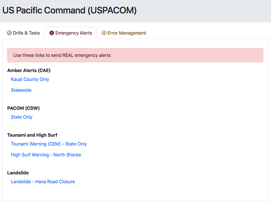
    So, I did something I don’t normally do and put together a page in a few minutes with all off the shelf stuff and I think it shows that just a few minutes of effort could really improve this site.

    I know it looks like it’s straight from Bootstrap and that’s kind of the point.  I used the starter template and copied examples in the documentation, added font awesome and quickly made a tabbed interface that groups and lists each type of alert clearly.

    I would never want to mix the test/live actions together, but if I had to, I think it should default to the one with less ramifications if it was sent in error.

    And the live links should have some visual indicators to show they are for actual emergencies.  Looking at the screenshot, I now think all of the links should be color coded as well, but there are a million other refinements that I would go add with time.

    Luca added an error management section to issue a false alarm.  I think it’s good to have a section for other links, but I’d also display a banner or some type of message to cancel the alert immediately after it’s sent.

    And there has to be some sort of confirmation to issue an emergency alert.  Realistically, it would be on the next page where they type in the alert message.  And as a side note, I’m not sure why the Bootstrap danger button color doesn’t match the danger alert and text.

    This is all out-of-the-box, basic Bootstrap stuff but I think some simple changes would make a big difference.

    And knowing Hawaii, I still have so many questions on this interface.  Like why the Amber alert is only for Kauai County or statewide?  What about the other counties?  And should this then be a different input to select multiple counties?  Maybe the North shore high surf warnings are supposed to be state wide, but I think of Oahu when I think of the North shore (and one of my favorite old, bad movies.).  But then, why is the landslide alert only for Hana, which is in Maui?  Would people on the big island need to get that alert?  Again, so many questions…

    If nothing else comes out of this, this is something that should be in every book about the importance of design.

    Here’s a link to my test page.