Earlier this year, there was a lot of tension with North Korea and a huge accidental scare in Hawaii when an employee mistakenly sent out an emergency alert warning of a ballistic missile attack. What made matters worse is that there was no way for the state to cancel the message and it took 38 minutes for them to retract it.
I can’t image the state of panic, then relief and then anger when they learned it was all a mistake. I have to believe more than a few people said some terrible things to some, confessed love for others or did a whole lot of regrettable things. But the worst part of it all, is that it was easily preventable with just the slightest bit of effort of UX/UI design.
This is the the screen the employee had to use:
How is that even possible for something so important? My only comment is that I know (and love) Hawaii and I feel like I know how government contracts work and this is the result of the two.
But I also know it’s easy to criticize and even ever to criticize without providing any solutions. The internet is an amazing place and many people quickly mocked up some quick fixes, none more popular than this one by a UX Designer, Luca Milan. He separated the different types of alerts and it’s so much more clear.
When I thought about this, my first question was, why are the test and live alerts on the same system, let alone the same page? And then, if they have to be on the same page, why aren’t they in different sections and why are they labeled so poorly? But I’ve worked with plenty of engineers to know the reason why and I’ve without a doubt made some bad design decisions myself.
So, I did something I don’t normally do and put together a page in a few minutes with all off the shelf stuff and I think it shows that just a few minutes of effort could really improve this site.
I know it looks like it’s straight from Bootstrap and that’s kind of the point. I used the starter template and copied examples in the documentation, added font awesome and quickly made a tabbed interface that groups and lists each type of alert clearly.
I would never want to mix the test/live actions together, but if I had to, I think it should default to the one with less ramifications if it was sent in error.

And the live links should have some visual indicators to show they are for actual emergencies. Looking at the screenshot, I now think all of the links should be color coded as well, but there are a million other refinements that I would go add with time.
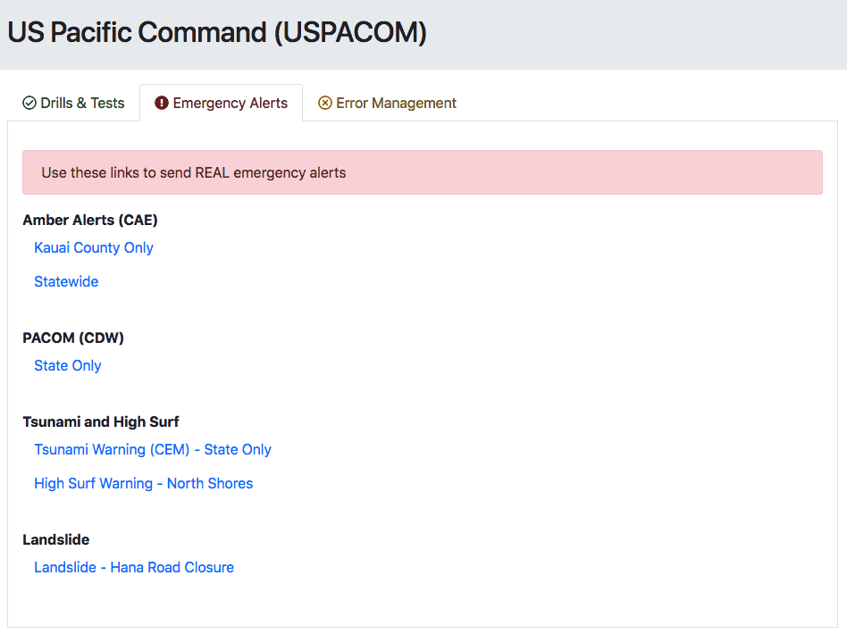
Luca added an error management section to issue a false alarm. I think it’s good to have a section for other links, but I’d also display a banner or some type of message to cancel the alert immediately after it’s sent.
And there has to be some sort of confirmation to issue an emergency alert. Realistically, it would be on the next page where they type in the alert message. And as a side note, I’m not sure why the Bootstrap danger button color doesn’t match the danger alert and text.
This is all out-of-the-box, basic Bootstrap stuff but I think some simple changes would make a big difference.
And knowing Hawaii, I still have so many questions on this interface. Like why the Amber alert is only for Kauai County or statewide? What about the other counties? And should this then be a different input to select multiple counties? Maybe the North shore high surf warnings are supposed to be state wide, but I think of Oahu when I think of the North shore (and one of my favorite old, bad movies.). But then, why is the landslide alert only for Hana, which is in Maui? Would people on the big island need to get that alert? Again, so many questions…
If nothing else comes out of this, this is something that should be in every book about the importance of design.
Here’s a link to my test page.